App Builder User Interface
Sections of the App Builder
The App Builder contains four separate sections.
General - covers basic information about the App
Data - enables the attaching of Data Assets that can be swapped out
Parameters - set configurable parameters that are sent as arguments to run the script
Display Result After Run - choose output files to display in the main window
General
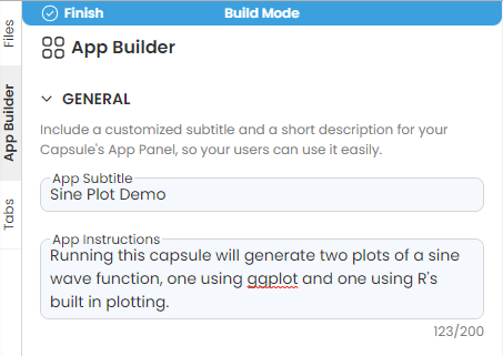
This section allows you to set the title for the application along with a short description of the App usage. Once this section is filled out, it will include an automatic link to anyREADME.mdfile contained within the capsule. It is recommended to create aREADME.mdfile along with the application to help users understand the functionality of the tool, the inputs and outputs of the application, and any additional necessary information.
The example below shows the completion of the General section. This Capsule plots a sine function.
This description will not appear outside of build mode until data or parameters have been added to the Capsule.
Data
Data consists of any Data Assets that can be attached to the Capsule. The Capsule should be coded using data found in the mount point of the Data Asset selected in build mode.
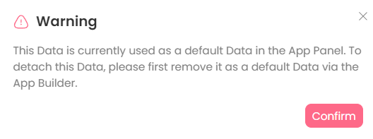
Data Assets that have been attached and set up outside the App Panel in the sliding window, can be replaced or swapped out. Edit access to the Capsule allows the attachment of new Data Assets using Managing Data Assets in the Files tab. However, if a Data Asset is used in the App Panel, there will be a warning message when trying to detach that Data Asset from the Capsule.
Attaching Data Assets to the App
You can add a Data Asset that is already attached to the Capsule to this session as a default Data Asset.
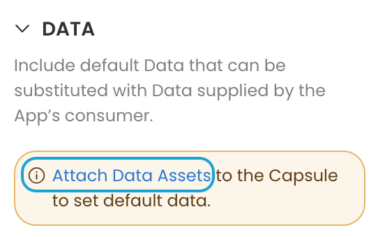
If there is no Data Asset attached yet, you will see a reminder for attaching a Data Asset.
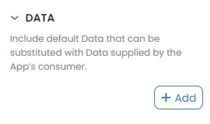
Click Add
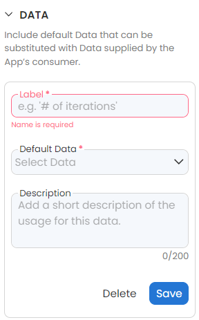
Provide the information for the:
Label
Default Data
Description
Click Save
Unlike other parameters, the Data Assets will be mounted to the capsule and there is no argument for using it.
Parameters
Types of Parameters
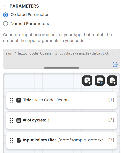
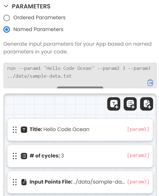
App Panel supports three types of input parameters. The icons at the top of the Parameters panel represent each type:
| Icon | Type | Functionality |
|---|---|---|
Text Parameter | Enter any string or number. Input files using the file parameter are not tracked in the same manner as data assets. it is preferable to add data as a data asset when possible. | |
List Parameter | Select one value from a list | |
File Parameter | Select an existing file under /data folder or upload a file from local machine |
Method of passing the parameters
Ordered parameters This is the default method. The parameters will be passed in order. The number indicates the sequence of the parameter when it is passed to the main script.
Named parameters The parameters will be passed in order with the name. When choosing this method, you can modify the parameter's name.
Swapping the Order of App Panel Parameters
Display Result after Run
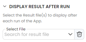
This allows you to set results to display to the user after running the Capsule. These are static paths, so the outputs will need to have the same name for every run.
Click on Add to add a file to display
Select a file from the drop-down. The list is from the latest run.
A Reproducible Run must be done in order to see available results files to display after the run.